multimodal car display
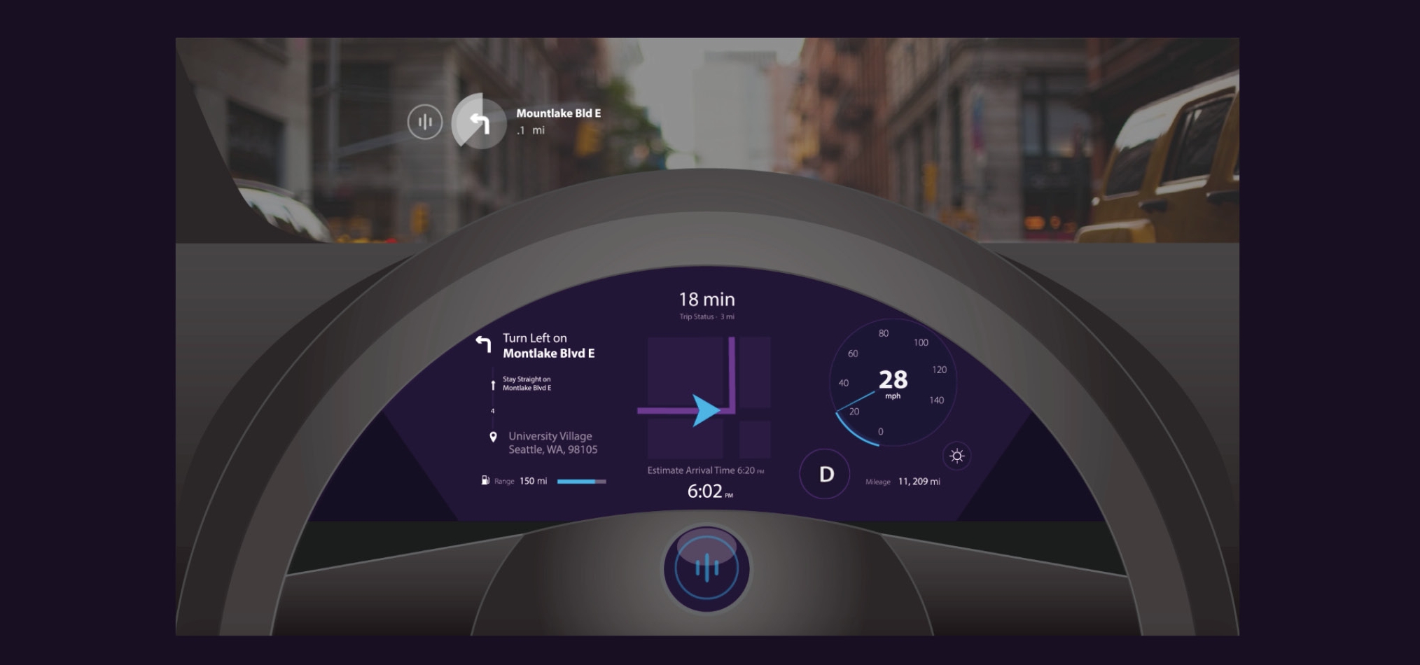
Oslo is an in-car navigation assistant that uses directional voice controls, a context-aware dashboard, a heads-up windshield display, and haptic feedback to keep the driver’s eyes and mind focused on the road while navigating.
Team
Brandon Caruso
Branden Keller
Brian Orlando
Project Timeline
2 weeks concept project
My Role
Interaction Design
Setting Design Principles
Video Animation
opportunity
Current Voice UI Increases Driver Distraction
AAA's study shows how many of today's voice-control driving assistants increases driver distraction and therefore, increasing their cognitive load.
Tesla touch display
Lack of Navigation Integration
Placing navigation instructions in the middle console (as shown in Tesla Model S) makes it hard for the driver to glance at it quickly. In addition, most drivers use their smart phones as their primary navigation tool which requires an attachment tool and was not well-considered during the car design stage.
design principles
Through our research in the problem space, our team focused on designing a better navigation since it was the primary interaction for the driver and defined the following 3 Design Principles:
DESIGN PRINCIPLE #1
Minimise cognitive Load
design principle #2
The system should support the driver to
focus on the driving environment
DESIGN PRINCIPLE #3
The system should not draw unnecessary attention to itself
ideation
Since we only had 2 weeks to finish the entire prototype, our team quickly dived into ideation after research.
competitive analysis
We did additional research for current car UI's with the goal of:
- Understanding the difference between a "modern" vs. "familiar car UI
- Color differentiation and its consequences on safety
- Placement and size of type and UI
ideation on multimodal feedback and flow
From our conversations on the difference between haptic, visual, and auditory feedback in a car environment, we concluded:
- Haptic: So jarring to the driver that it is only used for safety-critical moments
- Visual: Good for flipping through information, so will be used to give "larger context" information (like where to go in the next 3 steps)
- Auditory-Voice: Can be both short and concise + conversational, we blended a mix between the two with a focus on the former to maintain driver's attention on the road
final Sketches
These sketches helped translate our features into a visual dashboard to discuss placement, sizing, and flow of the experience.
solution
Oslo is an in-car navigation assistant that uses directional voice controls, a context-aware dashboard, a heads-up windshield display and haptic feedback to keep the driver’s eyes and mind focused on the road while navigating.
Oslo is contextually-aware and provides feedback at the time needed in a meaningful form to enhance the driving experience for the user.
voice: DIRECTIONAL VOICE CONTROLS
Oslo gives focused directions based on landmarks in addition to street names. In moments where sudden turns are required, Oslo's voice will be louder in the direction of where the driver would need to turn to.
Oslo also "lives" in the steering wheel to build trust with the driver by bridging the mental dissonance between the system and the car itself.
Solution for: Driver Distraction (through Voice UI)
visual: CONTEXT-AWARE DASHBOARD
Map directions adjusts its view based on both the stage of the trip and also the incoming directions - ie: showcasing a further distance if the driver will be driving straight for a long time (opposite if there are many turns).
These instructions appear in-between the steering wheel so that the driver can choose to glance at it when needed but is not distracting if he/she doesn't need it.
Solution for: Integrating Navigation with the Car + Easy Glancing
visual: HEADS-UP WINDSHIELD Display
Turn-by-turn timed navigational directions displayed on the HUD so that the driver can keep their eyes on the road.
Solution for: Design Principle #1 - Minimise Cognitive Load
touch: HAPTIC FEEDBACK FOR SAFETY ALERTS
In the event of an emergency, Oslo alerts the driver through haptic feedback on the steering wheel.
Solution for: Driver Distraction (through Voice UI)
final concept video
Link to video: https://vimeo.com/194755435
if we had more than 2 weeks...
Test the readability of the typefaces and font size: Prototyping a car display through a computer screen can hide many pitfalls of the design when it is used contextually. One of these pitfalls would be around font sizes and clarity of typefaces when the display is put at a distance from the driver.
- Ergonomics: Although we did do light contextual inquiry for in-car systems (that we had access to), designing for the car scenario requires us to think about people's lines of sight based on their height and posture. In particular, I would want to test the "glance-ability" of the context-aware dashboard.
- Bringing push buttons back: One of the concepts we did not have time to explore was how a 3D physical button can improve driver attention on the road in comparison to 2D icons. Current trends of placing touch screens in cars decreases driver safety due to the need for them to focus their full attention on what and where to click with there is no haptic feedback.


